Category: design
-

Agile UX Manifesto
during a workshop to share ideas on how developers and stakeholders could work better with designers and user experience professionals, I jumped at the chance to create my own version.
-

Scrum Masters, Adapt!
I’m writing a three part series on the pillars of Scrum. These are at the heart of what is means to “do Agile” in my mind. Those three pillars of scrum are Transparency, Inspection and Adaptation. Today I want to talk about what I think is the most important pillar for a scrum master, adaptation.…
-

Five Tips for Using Color
Many developers and designers I talk to are very frustrated when it comes time to pick colors for a project. It can be hard to choose the right color or set of colors for a project. Here are five quick tips for using color in your next project so you can make the best user…
-

Evaluating digital products and sites using heuristics
I’ve been in this scenario and you probably have too: there is a new feature on a site or in a product to review but time is short. What is the most efficient and fastest way to get quality internal feedback? How many people do you really need to review and help with testing before final sign…
-

Adobe XD Test Drive
I recently needed to create wireframes for a project and decided to take Adobe XD (also known as Adobe Experience Design) for a spin. Here are my “play-by-play” impressions. * *note: Some of the issues in this article were addressed by Adobe in recent patches. I wrote the original version of this article several months ago…
-

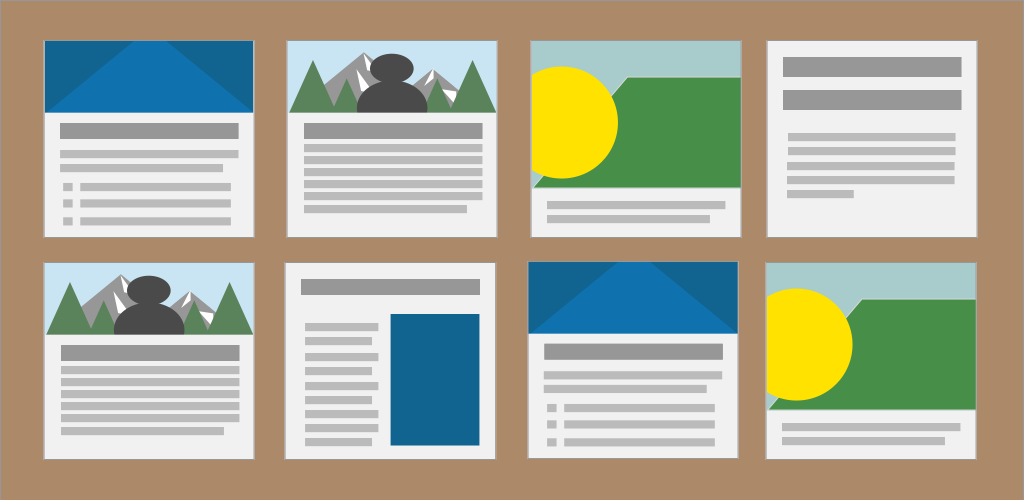
When should card patterns be used?
I read a very interesting article on Medium recently by Rob Gill about a real world struggle with using cards. After a new feature launch on a sports news site, there was the usual amount of user backlash to change. However, some of the user feedback gave valuable insights about why they thought the new…

